[tweetmeme source=”tm4smallbiz” only_single=false http://wp.me/pz34L-d5]
There are lots of sporting events going on this time of year. The US Open just ended, as did the FIBA World Championship in basketball. The NFL season just began. In golf, the Ryder Cup is coming soon and the FedEx Cup on the PGA Tour is ongoing. Which of these championships have great logos?
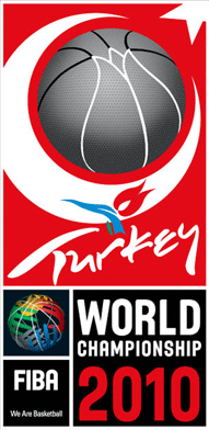
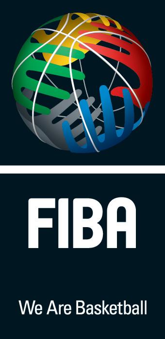
- FIBA World Championships – The world championship logo is nice – it combines a basketball with the moon and star images of the flag from the host country Turkey. I like the FIBA logo, not the championship, logo even more – it is a basketball with hands wrapped around it in a variety of colors demonstrating the worldwide multicultural reach of the game.
- FedEx Cup – The FedEx Cup logo is registered. But it is not terribly creative or memorable. It takes the FedEx logo and adds the flight of a golf ball and uses the “u” as the “hole.” FedEx is one of my favorite logos of all time (see blog here), so I guess I just expected more. The FedEx Cup logo is boring, lacks pizazz or excitement.
- US Open tennis – I love this registered logo. It’s simple yet shows excitement and energy – flame, movement, subtle shape of a tennis racquet head and a ball in flight at the same time.
- Ryder Cup – the logo is a classic golf logo. Not terribly exciting but does present the important elements of a championship and a challenge between two sides.
Bottom line: The FIBA logos are the most imaginative. The US Open logo for me is the best of the bunch, simple and classic yet suggestive of excitement and speed. It communicates a message to the viewer and does it well.


 (pending applications for these logos

