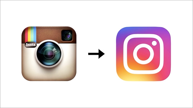
This week, Instagram announced a logo revision. It was promptly bashed by many, and I agree with those that question it. The old logo was well recognized and quite nice. I don’t know why any change was needed. It was not stale or dated (other than intentionally looking like an old camera). The new logo is less distinctive, less original, and has less character.
An additional failure regarding the new logo: it does not appear that any trademark application was filed for it at the USPTO prior to the unveiling.

image via AdWeek
Instagram grows a growing list of logo redesign failures:
- Love it or leave it? Uber’s new logo
- Love it or Leave it: new American Airlines logo
- New ACC logo: Love it Leave it?
- Love it or Leave it: NBCUniversal unveils new logo
- Netflix new logo – Love it or Leave it? #INTA14
- “New” GAP Logo: Worst Marketing Failure Since New Coke?
- Love it or leave it: University of Colorado at Boulder’s $780,000 logo change


