There are many different varieties of creative, fun logos. I especially enjoy those with whitespace or negative space designs inside of them. For example, the FedEx logo, in my opinion, may be the single greatest logo ever used by a big company.

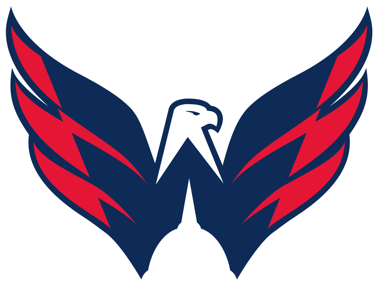
There are many examples of such logos. I also especially like the Washington Capitals hockey team:

Last week, Tiger Woods unveiled a new logo, below. It features a negative space “W” and appears to be three trees. I like it, because it is simple and subtle, but for the negative space addition.

What is your favorite negative space logo? Here are some more of my favorites:


Here are some links to articles with many great logos featured:


